

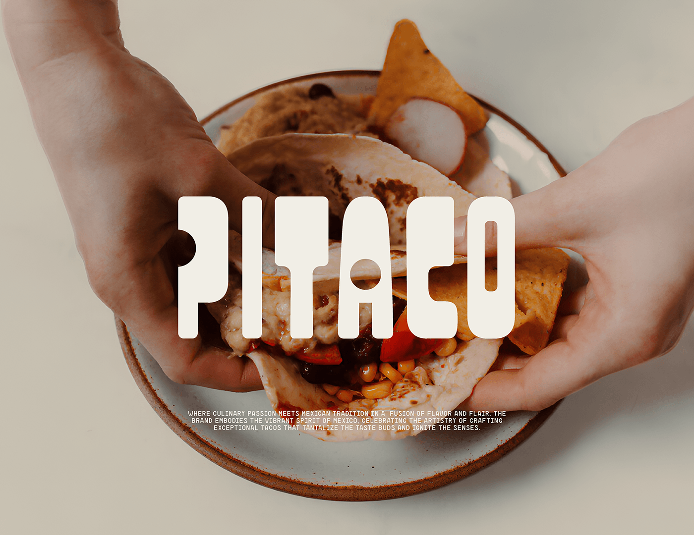
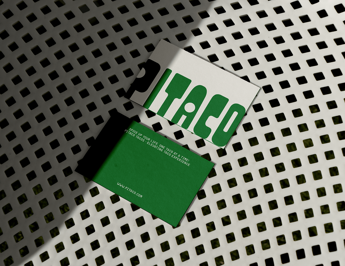
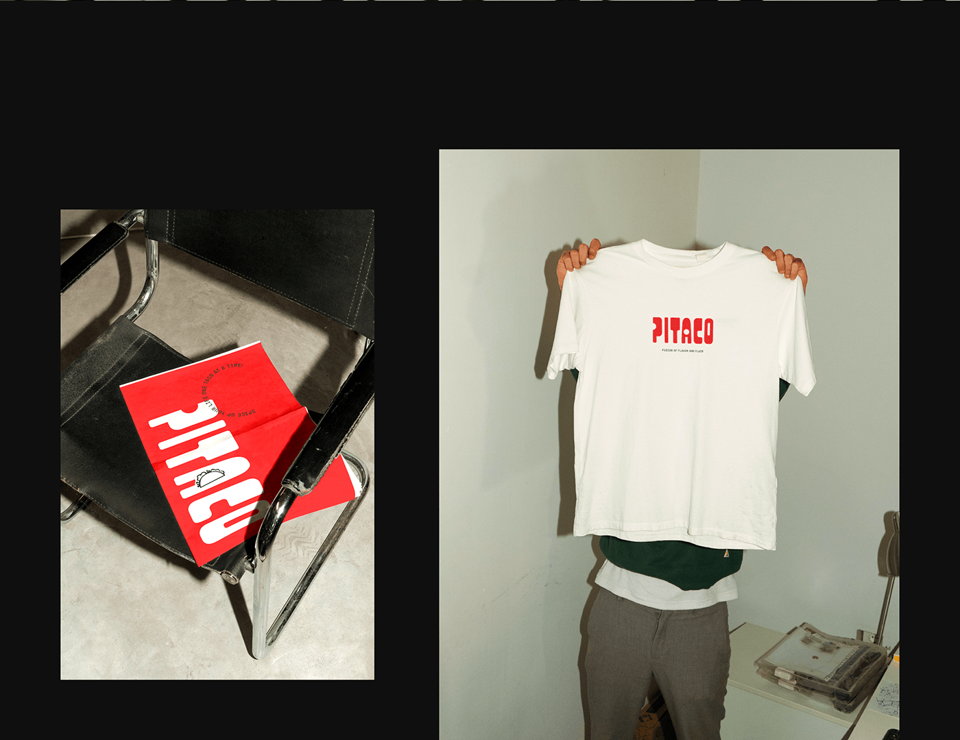
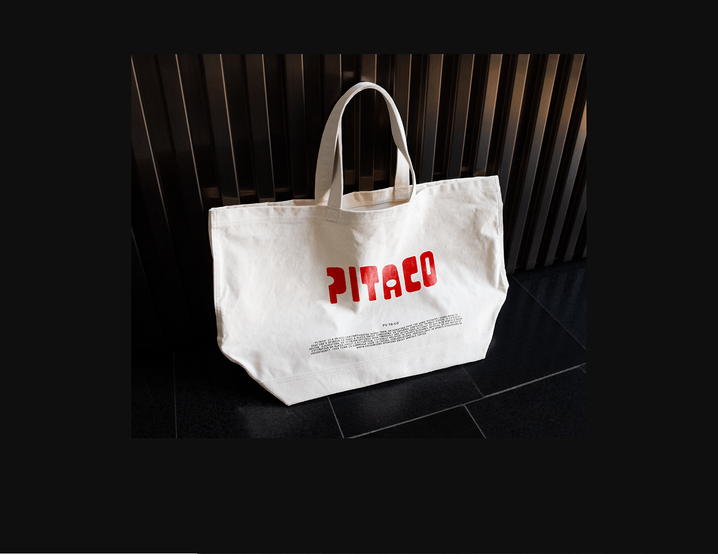
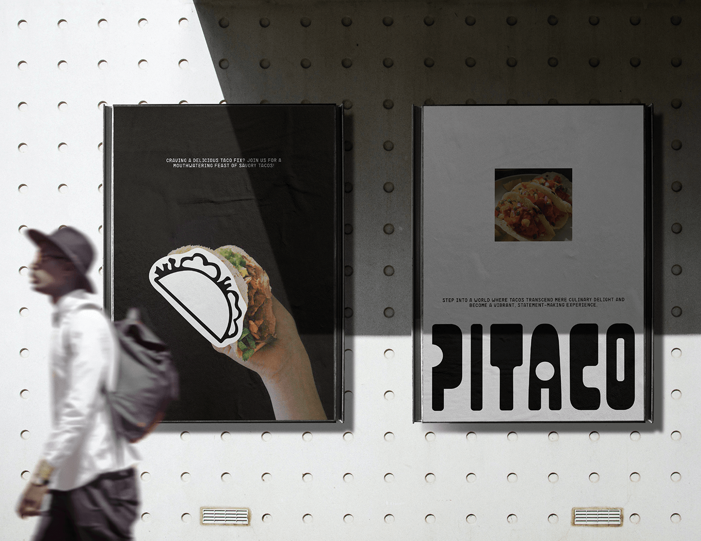
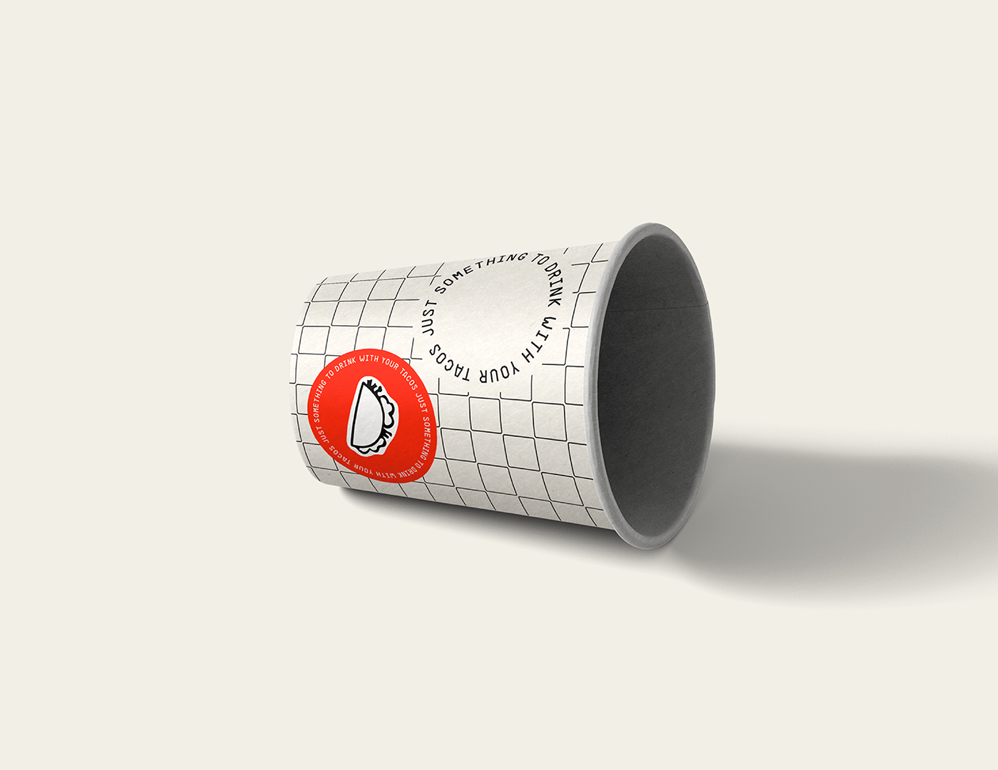
PITACO was conceived with the vision of delivering authentic Mexican cuisine, particularly celebrated for its outstanding tacos. The primary goal in crafting its identity was to encapsulate the brand's ethos that dining on great food should be nothing short of vibrant and fun.
As a result, an identity was created and designed to reshape the perception of what a Mexican brand embodies. The primary inspiration stemmed from the origin of its name, which is derived from a slang term in Portuguese. This slang term carries connotations of energy and vibrancy. To convey this essence, the brand combines dynamic typographies with vibrant colors, maintaining a fresh, clean, and bold style.
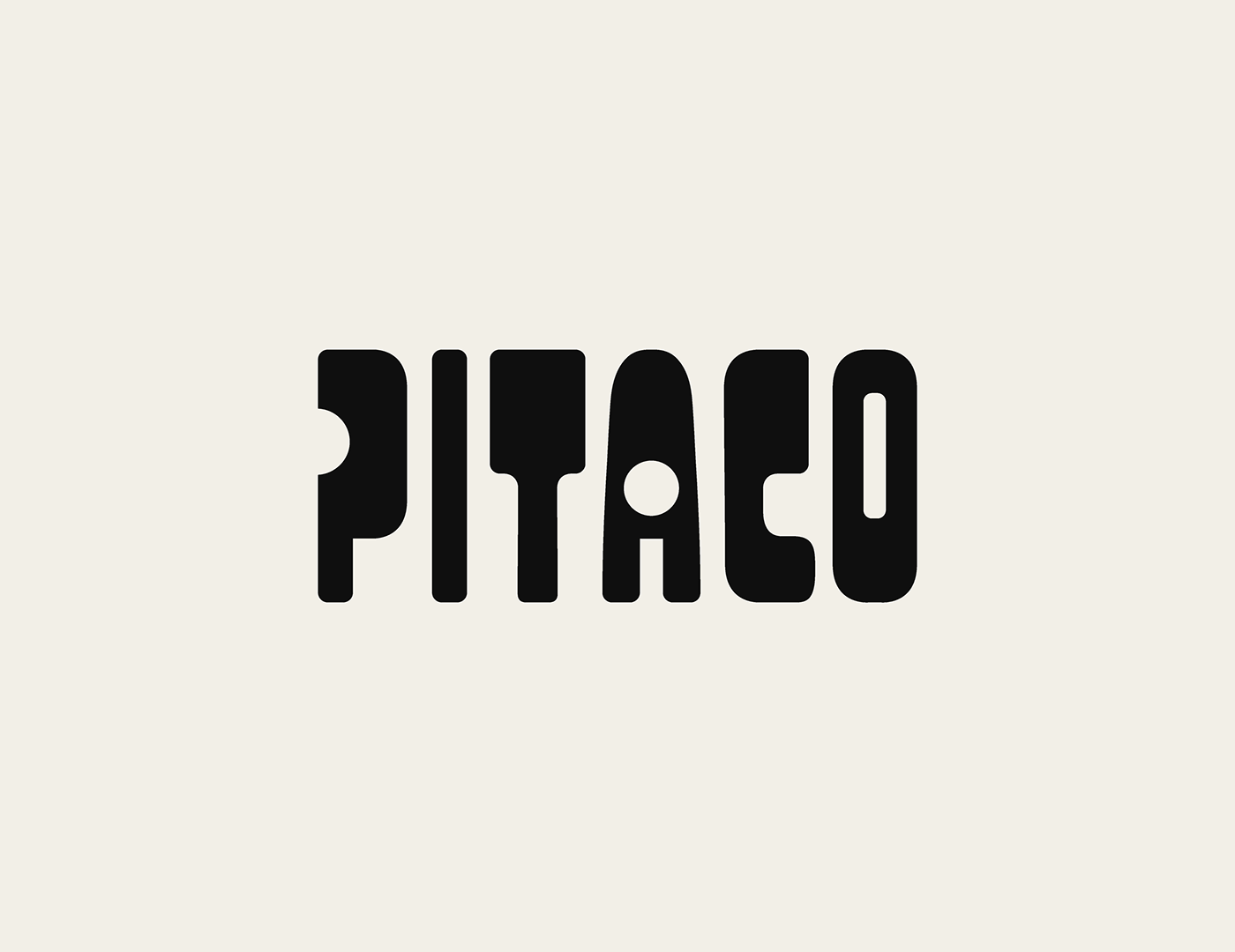
The term "PITACO" originates from brazilian slang and carries an informal and energetic vibe.
In Portuguese, "pitaco" refers to a spontaneous comment, often given in a lively manner. It's a term
that's commonly associated with casual conversations, where individuals share their thoughts or opinions in an engaging way. It also serves as a playful play on words, as it sounds similar to "taco", adding an extra layer of meaning to the brand name, reflecting the spirit of spontaneity and excitement.

Non-commercial project.
You can buy this brand identity concept for your brand (with a name change)
Contacts below or write me in messages.
Contacts below or write me in messages.
Thanks for visiting!
For contact me:
e-mail: designaluinfo@gmail.com
telegram: https://t.me/designalu
e-mail: designaluinfo@gmail.com
telegram: https://t.me/designalu


